
Johnnie Walker
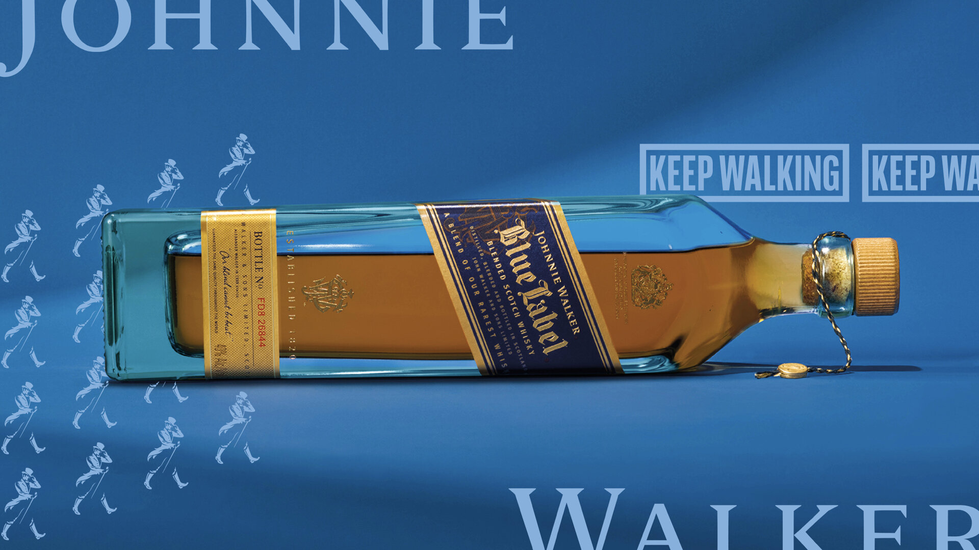
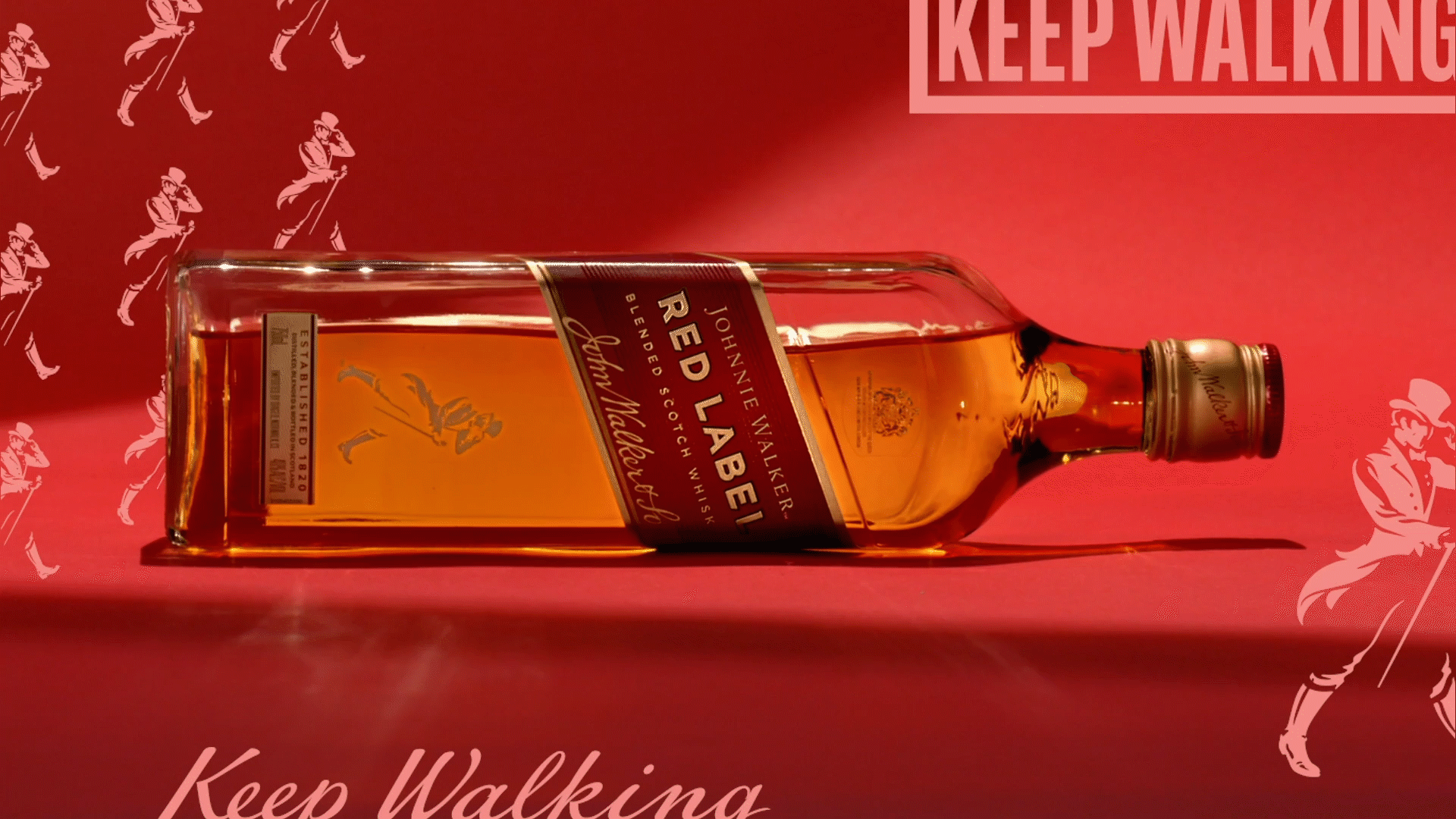
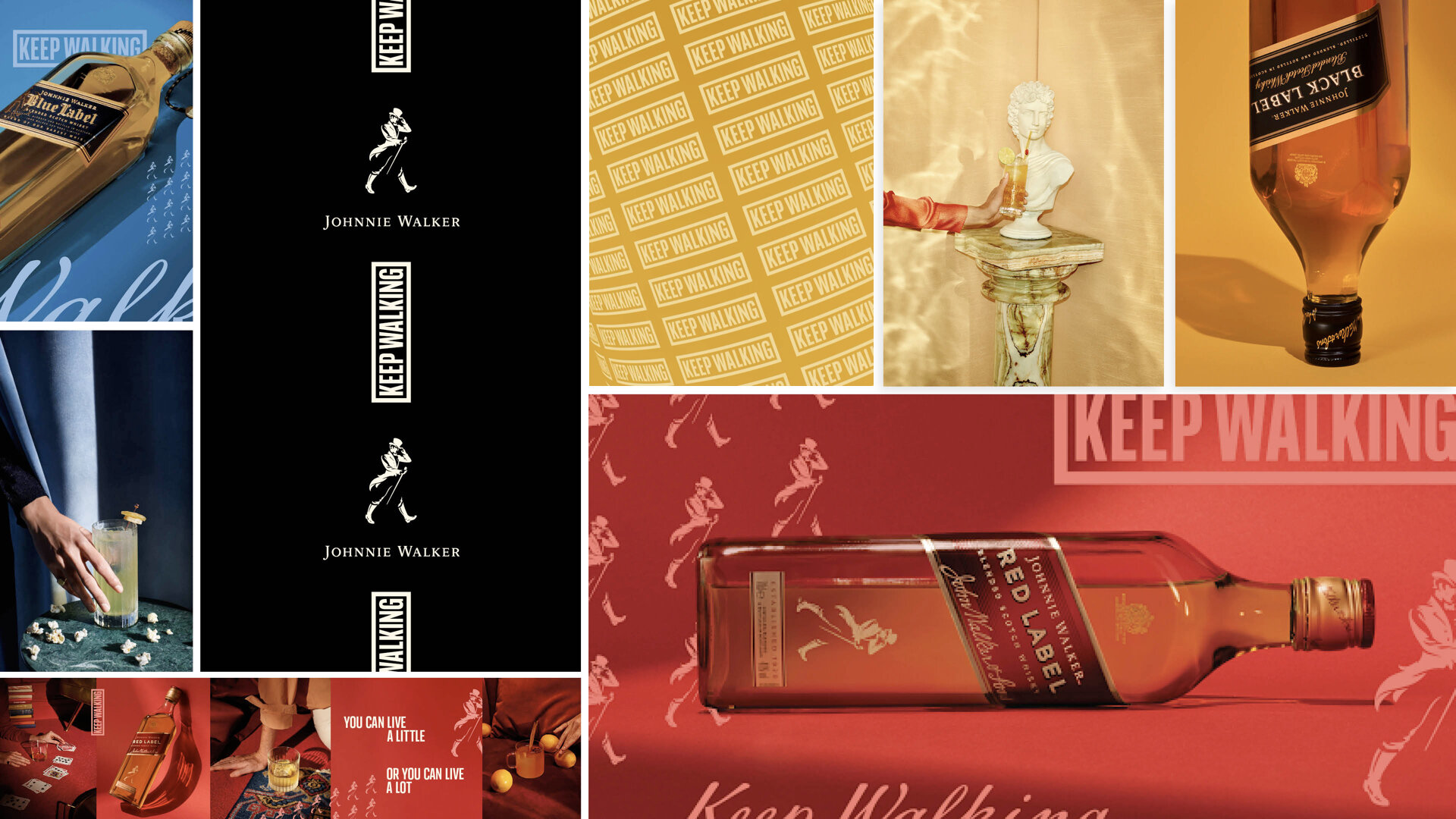
A 5-year journey that has reinvigorated the Keep Walking philosophy and a global brand refresh that repositions Johnnie Walker in the minds of a new generation of drinkers, alongside a system that impacts every facet of the brand.






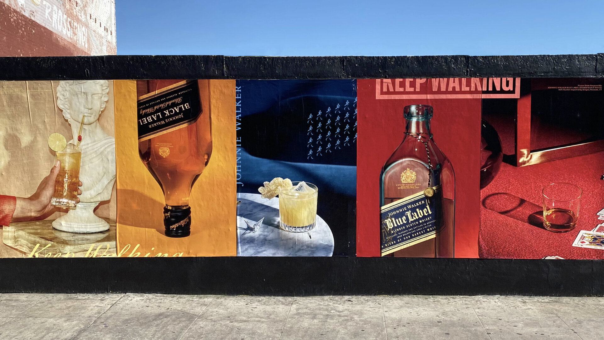
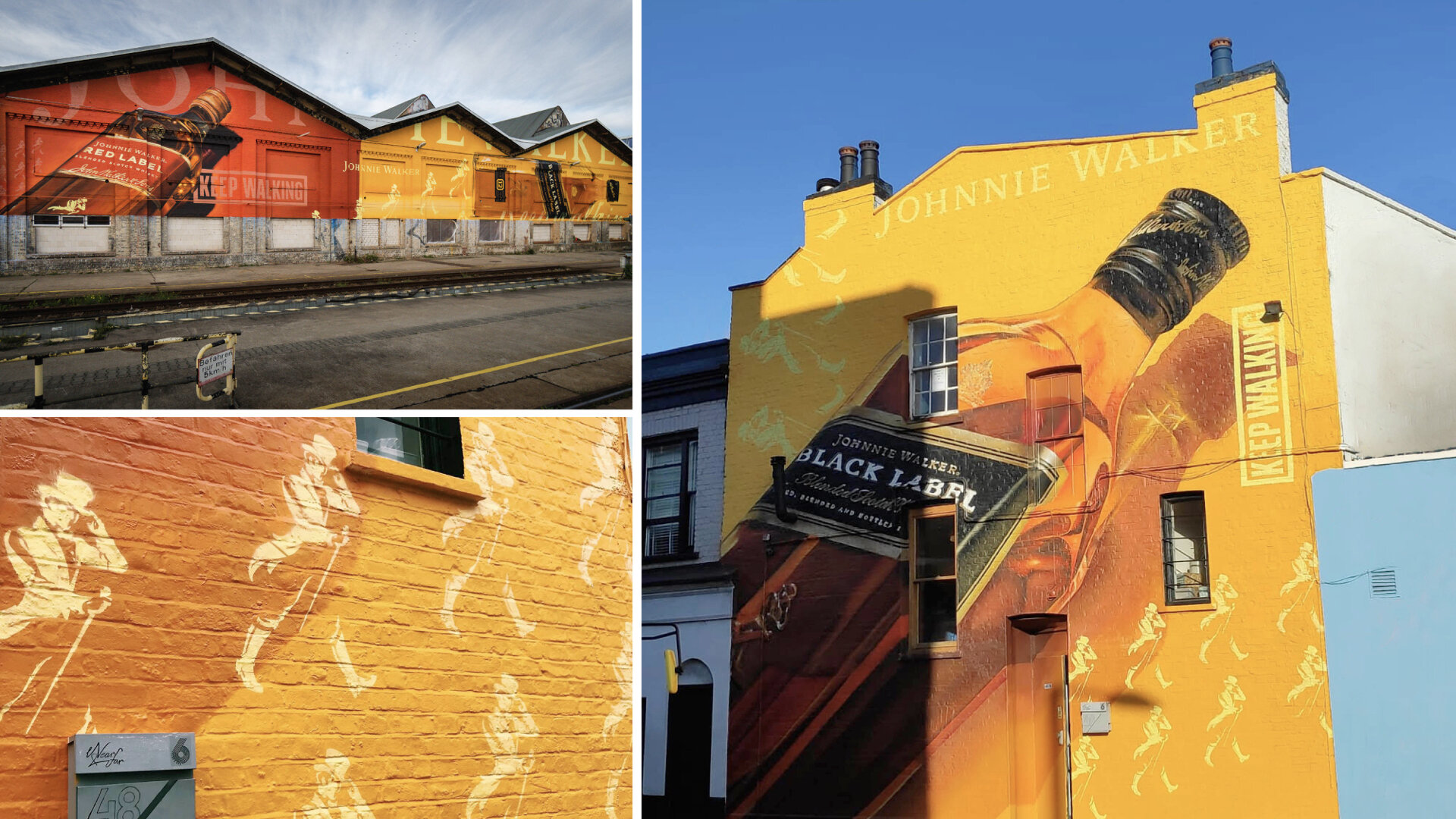
OOH







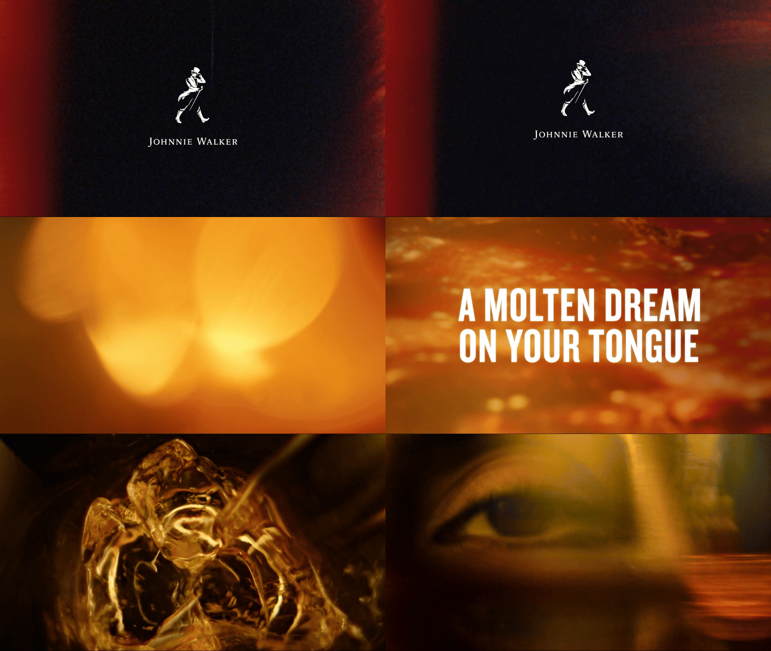
The Johnnie Walker Metaphor series captures the visceral experience of Johnnie Walker. This isn’t about literal tasting notes, rather communicating the feeling of the drink. A cactus flower represents the spiky feel of Johnnie Walker Red hitting your tongue. Or mesmerising jellyfish convey the smooth build of Johnnie Walker Blue. It’s about the abstract. It’s about mystique and intrigue. It’s about tapping into the sensory experience of each variant with a visual that will stop our audience in their tracks and look unabashedly different.
Less explanation, more feeling. Less literal, more emotional. Less stagnant, more dynamic. The Metaphor Series gives Johnnie back its heartbeat. Scotch is dead. Long Live Scotch.


Design Director / Behrad Taherparvar
Strategy Director / Ant Harris
Art Director/Designer / Rhiannon Brackpool